LiveCode Create Responsive Layout: Rows and Columns
This is the first of a few posts made to go into more depth about specifics regarding Create’s Responsive Layout. Its purpose is to allow you to set properties for containers and their contents, so that they automatically resize and orient themselves correctly, regardless of the shape and size of the device you’re making your application for. By using Responsive Layout, you’re able to achieve this without needing to write any script! A more general overview of it can be found at Responsive Layout in LiveCode Create | LiveCode Documentation.
In this post, we’re going to focus on two important types of containers for Responsive Layout: Columns and Rows. But first we need to understand the relationship between parent containers and their children. You can select the parent to change how a collection of objects inside it are arranged, and then select a child to change how that particular child participates in the arrangement. With Responsive Layout, you have access to properties you can set for your containers that will apply specific rules to that container’s contents. An example would be a Column, which is a standard LiveCode group when you first create it, except that it applies a rule to everything inside it that means that everything will be stacked on top of one another vertically. If the parent container is a Column, all its children will be forced to order themselves like this.
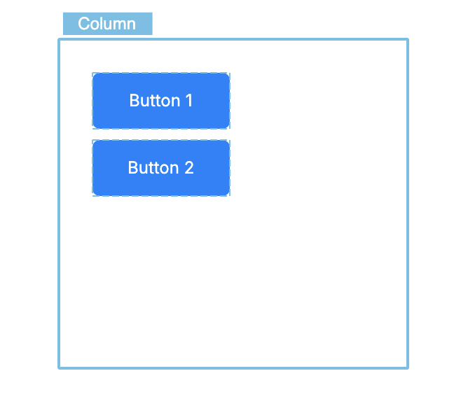
Here is an example of a Column container with 2 buttons inside it. If I try to change the location of these buttons, they will snap back to their current positions. Other Responsive Layout properties would need to be changed to adjust their positioning.
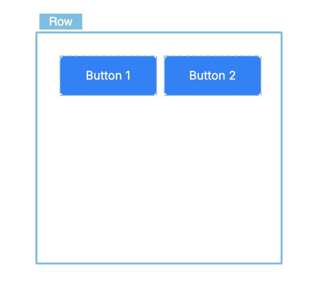
Similar to a Column, a Row is a container that applies a restriction to its contents that positions them from left to right automatically. The type of any container can be changed in its Property Inspector by changing its content type. An object’s Responsive Layout properties exist in the second tab in its Property Inspector. Here you can see I’ve taken the Column and changed its content type to be Row, and so now the 2 buttons are positioned side by side.
Building an account form
Now we’ll use these containers to make a form for displaying account information. Find and drag out a Column in the Tools Palette, name it accountColumn, and then add these widgets inside it:
| Widget | Name | Suggested content |
|---|---|---|
| Label Field | accountTitle |
Account settings |
| Label Field | accountIntro |
Update the details associated with your account. |
| Input Field | displayNameField |
Label: Display name |
| Input Field | emailField |
Label: Email address |
Then find and drag a Row into the Column beneath the fields and name it actionRow. Add two Buttons inside that Row:
| Widget | Name | Label |
|---|---|---|
| Button | cancelButton |
Cancel |
| Button | saveButton |
Save changes |
Despite being a parent of its own content, this Row is still considered to be a child of accountColumn, and so obeys the rule of being positioned under the other children of accountColumn.
When working with Responsive Layout containers, it’s very helpful to look at the Project Browser to keep track of what layers various objects are in. The order in which objects are positioned in a Row or Column can be changed by dragging them higher or lower in the Project Browser. Before carrying on, I’d recommend resizing both containers to be large enough for all their contents to be visible inside them.
Responsive interfaces are normally built from several small, nested Rows and Columns. A Column can contain Rows, each Row can contain other groups, and each nested parent controls only its own direct children.
The main axis and cross axis
Rows and Columns use two axes to describe alignment.
The main axis is the direction in which the children are being arranged:
- In a
Column, the main axis is vertical. - In a
Row, the main axis is horizontal.
The cross axis runs across that direction:
- In a
Column, the cross axis is horizontal. - In a
Row, the cross axis is vertical.
Select accountColumn and open the Responsive Layout tab of the Property Inspector. Its Layout content is column. The options below it control the Column’s main-axis alignment, cross-axis alignment and direction.
Basic main-axis alignments
start: Place the children at the beginning of the main axis.center: Keep the children together and centre the complete collection.end: Place the children at the opposite end of the main axis.
For a normal downward Column, these mean top, vertical centre and bottom. For a left-to-right Row, they mean left, horizontal centre and right.
There are also spaceBetween, spaceAround and spaceEvenly choices. Those distribute spare space rather than simply placing the collection at one end or in the centre. We will cover their differences in the separate post about spacing and alignment.
Basic cross-axis alignments
start: Align each child to the cross-axis start.center: Centre each child on the cross axis.end: Align each child to the cross-axis end.stretch: Resize each child to fill the available cross-axis space.
For a Column, these mean left, horizontal centre, right and fill the width. For a Row, they mean top, vertical centre, bottom and fill the height.
Try switching accountColumn between these four settings. The labels and fields should move or resize horizontally without changing their vertical order. Update Cross Axis Alignment to stretch when finished.
Direction
This determines what direction the main axis of the container positions things in. For example, changing the direction of actionRow from left to right would make it so that its children are forced to be positioned from right-to-left instead of from left-to-right.
Align the nested Row
Select actionRow. Its Layout content should be row. Set these properties to the following values:
| Property | Value |
|---|---|
| Main Axis Alignment | end |
| Cross Axis Alignment | center |
| Direction | left |
For this left-to-right Row, end places the buttons at the right-hand end. Cross-axis center centres the buttons vertically inside the Row.
Notice that changing actionRow does not change the labels or fields above it. The Column only treats the complete Row as one of its children; the Row is responsible for the buttons within it.
You should now have something like this:
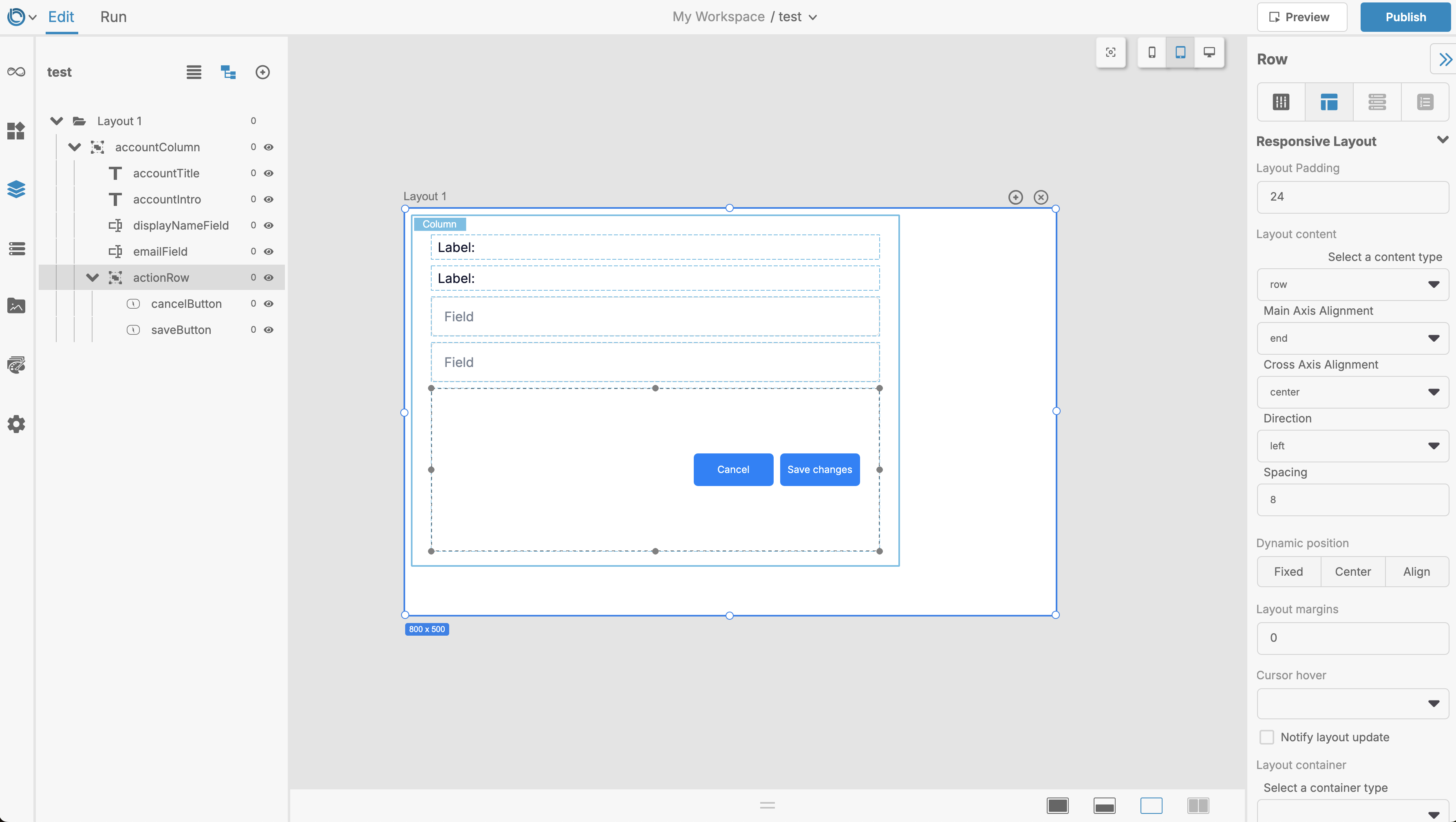
Remember that if you want to make it so that the save changes button is on the left of the cancel button, you can simply drag it to be at the top of the items in actionRow in the Project Browser.
Why managed controls snap back
If you hover your cursor over the saveButton and double-click a few times, you should have it selected. Try dragging saveButton away from the rest of the Row. It may move while you drag it, but then it will return to the position calculated by the Row. This is Responsive Layout doing its job. The button’s coordinates are no longer the main instruction for where it belongs. Its parent says that it is one item in a horizontal Row, so the next layout update puts it back into that relationship.
A responsive update can happen when you:
- Move or resize a managed control.
- Resize the
Layoutor app window. - Add, remove, show or hide one of the parent’s children.
- Change a responsive property.
- Move to another breakpoint.
- Open or preview the
Layout.
A parent’s Layout content is not the only rule that can restore geometry. A child’s Dynamic position can restore its position, while its Layout container can restore its width or height. Other posts will cover those properties in more detail.
What does not normally cause a geometry snap-back?
Changes unrelated to geometry—such as changing a label, colour or icon—do not reposition a control. A control also remains manually positionable when neither its parent nor its own Responsive Layout properties manage that part of its geometry. For example, a control placed inside a container that has its content type set to be blank can retain a manually chosen location. The children in this group can still have their own individual responsive properties.
If you set the content of a container or Layout to ignore, Responsive Layout can still size or position the parent itself, but it will not process that parent’s descendants. This is useful for a component that manages its own internal controls.
The same setup in script
Rows and Columns can be configured from script as well as through the Property Inspector. Once the groups exist, the equivalent core settings are:
set the layoutContent["type"] of group "accountColumn" to "column"
set the layoutContent["mainAxisAlignment"] of group "accountColumn" to "start"
set the layoutContent["crossAxisAlignment"] of group "accountColumn" to "stretch"
set the layoutContent["verticalDirection"] of group "accountColumn" to "down"

set the layoutContent["type"] of group "actionRow" to "row"
set the layoutContent["mainAxisAlignment"] of group "actionRow" to "end"
set the layoutContent["crossAxisAlignment"] of group "actionRow" to "center"
set the layoutContent["horizontalDirection"] of group "actionRow" to "left"