LiveCode Create Responsive Layout: Breakpoints
This is a follow-up to a previous post, which introduced Rows and Columns and showed how Responsive Layout can arrange controls automatically. Building on that account form, this post explains another key benefit of Responsive Layout: breakpoints.
A desktop window, a tablet and a phone can have very different amounts of space, but that does not mean an app needs three unrelated interfaces, or that custom script to resize pages to fit these different screen sizes is required. Breakpoints let one Layout use different responsive settings at different widths. This means that we can keep the parts of an interface that already work and only change the parts that need a different arrangement on a smaller screen.
What a breakpoint represents
A breakpoint is a named range of Layout widths. By default, Responsive Layout provides these three:
| Breakpoint | Default width range | Typical use |
|---|---|---|
Mobile |
Up to 480 pixels | Phones and narrow windows |
Tablet |
481–975 pixels | Tablets and medium windows |
Desktop |
976 pixels and above | Desktops and wide windows |
The names are useful design labels, but they do not detect what sort of physical device someone is using. The width is what selects one of these default breakpoints. A narrow desktop window can therefore use the Mobile breakpoint, while rotating a device can move its width into a different range as well. This is useful because the interface responds to the space that it actually has available instead of assuming how much space it has based on the name of the device.
Continue with the account form
Using the account form from the Rows and Columns post, its structure in the Project Browser should be:
Layout
└── accountColumn
    ├── accountTitle
    ├── accountIntro
    ├── displayNameField
    ├── emailField
    └── actionRow
        ├── cancelButton
        └── saveButton
If you are following this post on its own, create a Column containing two Label Field widgets (accountTitle and accountIntro), two Input Field widgets (displayNameField and emailField), and a Row container (actionRow). Then place two Button widgets (cancelButton and saveButton) inside actionRow.
To make sure accountColumn can fit inside the Layout at narrower widths, select accountColumn and set Layout container to fluid, then set Fixed Width to 500. Under Dynamic position, select Fixed, then enter 0 in both Left and Top. This allows the column to shrink to the available width while keeping its top-left corner aligned with the Layout. A later post will cover these Responsive Layout properties in more detail.
Switching between breakpoints
The controls for switching between the Mobile, Tablet and Desktop breakpoints are near the top of the Create IDE. Selecting one resizes the design area to a width within that breakpoint and lets you view and edit the responsive values used there.
Mixing shared and breakpoint-specific values
Responsive Layout stores settings for individual breakpoints. When a responsive setting has not been given a value at the active breakpoint, the library can fall back to a suitable value from another breakpoint. This allows the same arrangement to be used at more than one width without needing to rebuild the controls. For our example, we want to mix the settings in the following way:
accountColumnwill remain aColumnat every breakpoint.- The fields will keep the same responsive behaviour at every breakpoint.
actionRowwill remain aRowat theDesktopandTabletbreakpoints, but will become aColumnat theMobilebreakpoint.- The
accountIntrolabel will be visible at theDesktopandTabletbreakpoints, but hidden at theMobilebreakpoint.
Select the Desktop breakpoint, then select actionRow. If the Layout is too large to fit in the IDE, click and drag its name in the top-left corner until the relevant objects are fully visible. Then make sure actionRow has these values:
| Property | Value |
|---|---|
| Layout content | row |
| Main Axis Alignment | end |
| Cross Axis Alignment | center |
| Direction | left |
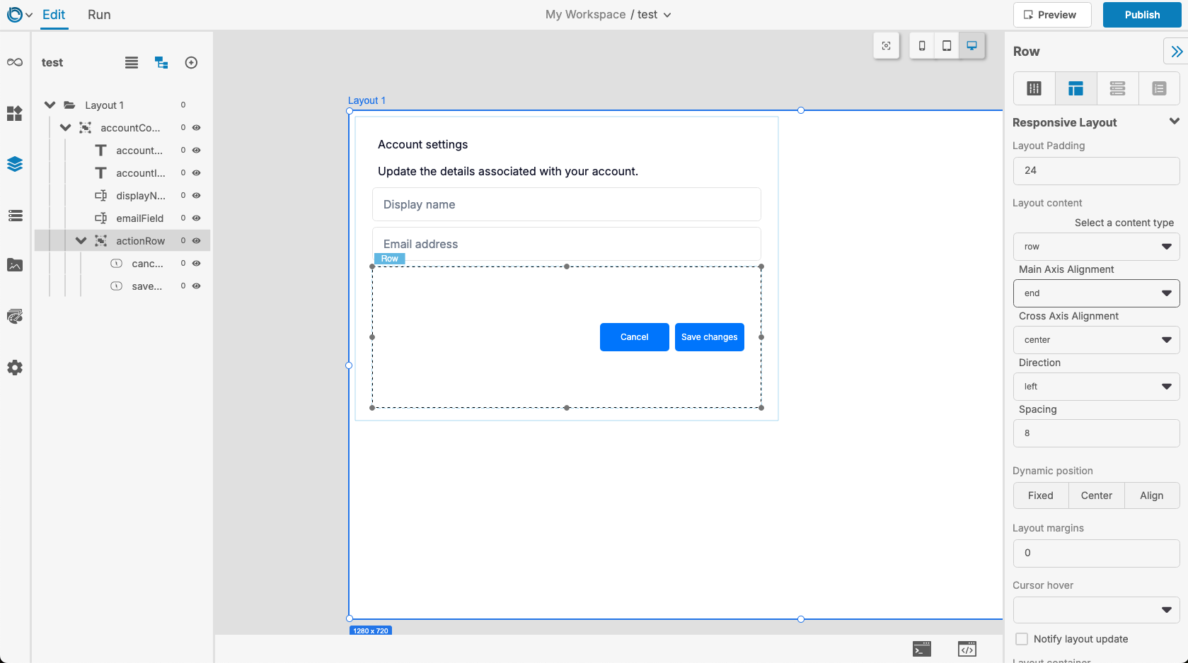
If you’re continuing with the Rows and Columns project, it should already have these values. This is because, when an object has no values set at the current breakpoint, Responsive Layout can fall back to values from another breakpoint. Therefore setting these properties for the Desktop breakpoint should make actionRow use them at both Desktop and Tablet here.
Now select the Mobile breakpoint, then select actionRow. It will also have these values through fallback, but we want to change its Layout content from row to column and set the following values:
| Property | Mobile value |
|---|---|
| Layout content | column |
| Main Axis Alignment | start |
| Cross Axis Alignment | start |
| Direction | down |
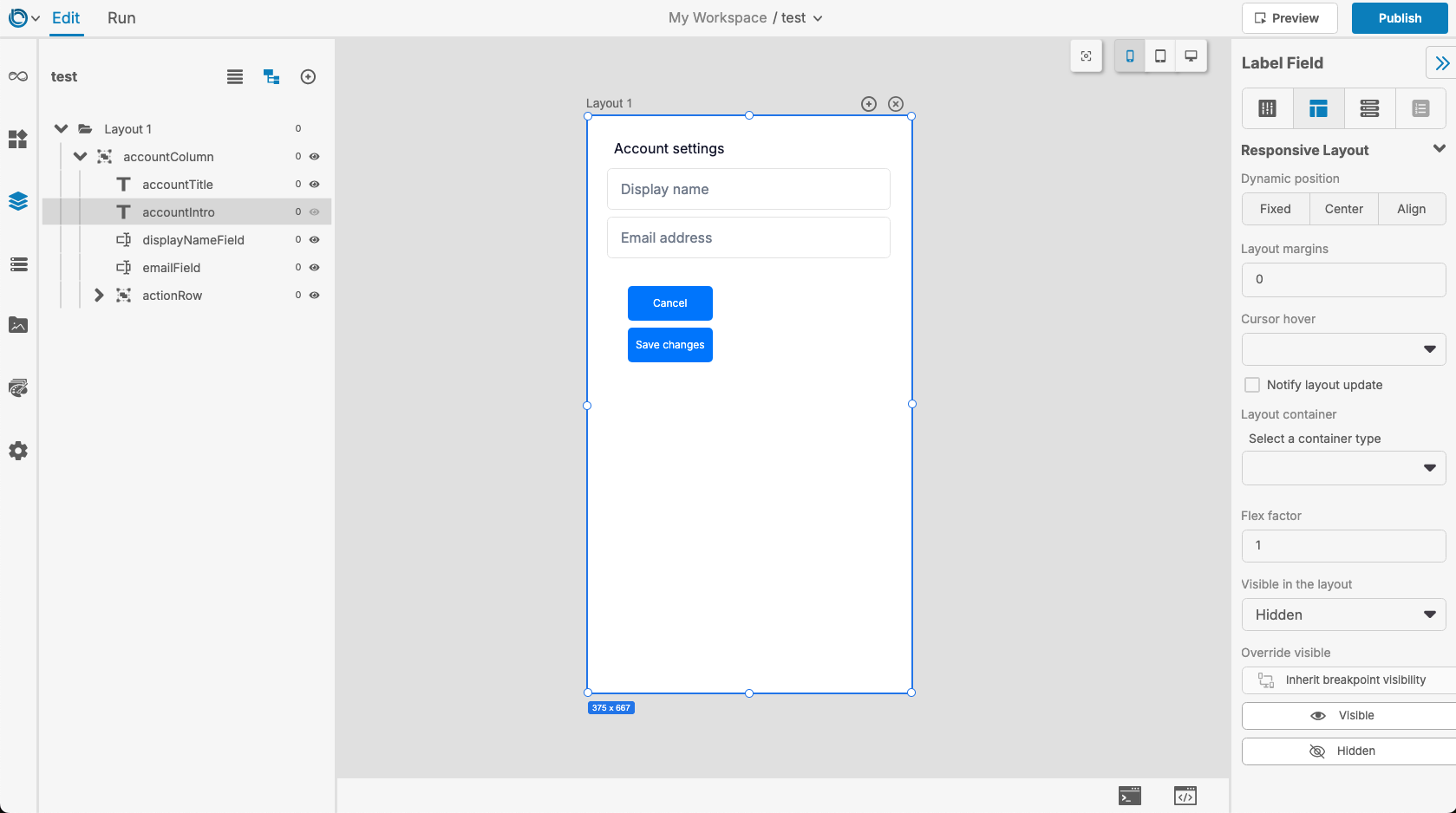
The Cancel and Save changes buttons should now be positioned one above the other and towards the left of actionRow. actionRow now uses a different arrangement at the Mobile breakpoint; this arrangement will be used whenever the app’s width falls within the Mobile range.
We can also control whether objects are visible at different breakpoints. Remain at the Mobile breakpoint, select accountIntro, and find Visible in the layout in the Responsive Layout tab of the Property Inspector. Set it to Hidden, then set it to Visible at both the Tablet and Desktop breakpoints. The widget’s visibility will now be set appropriately whenever each breakpoint becomes active, and the remaining controls in accountColumn will be laid out without reserving space for it.
There is also the Override visible property, which can force an object’s visibility at every breakpoint. This is useful from script when an object must be shown or hidden regardless of the active breakpoint.
What else can change between breakpoints?
Breakpoints are not limited to changing a Row into a Column. Responsive properties that can have different behaviour at different widths include:
- Layout content type and its alignment settings.
- Layout padding and child Layout margins.
- Dynamic position.
- Layout container sizing.
- Flex factor.
Other posts to come will explain these property groups in more detail. The important idea here is that their values can be mixed. One object might use the same parent arrangement at every width, while another has a Mobile-specific visibility or sizing value.
Breakpoint-specific values can also be set through script. The breakpoint ID is added to the property index so that each value is stored for the intended breakpoint:
set the layoutContent["type.desktop"] of group "actionRow" to "row"
set the layoutContent["mainAxisAlignment.desktop"] of group "actionRow" to "end"
set the layoutContent["crossAxisAlignment.desktop"] of group "actionRow" to "center"
set the layoutContent["horizontalDirection.desktop"] of group "actionRow" to "left"

set the layoutContent["type.tablet"] of group "actionRow" to "row"
set the layoutContent["mainAxisAlignment.tablet"] of group "actionRow" to "end"
set the layoutContent["crossAxisAlignment.tablet"] of group "actionRow" to "center"
set the layoutContent["horizontalDirection.tablet"] of group "actionRow" to "left"

set the layoutContent["type.mobile"] of group "actionRow" to "column"
set the layoutContent["mainAxisAlignment.mobile"] of group "actionRow" to "start"
set the layoutContent["crossAxisAlignment.mobile"] of group "actionRow" to "start"
set the layoutContent["verticalDirection.mobile"] of group "actionRow" to "down"

set the layoutVisible["desktop"] of control "accountIntro" to true
set the layoutVisible["tablet"] of control "accountIntro" to true
set the layoutVisible["mobile"] of control "accountIntro" to false
Notice that properties such as layoutContent have both a subproperty and a breakpoint ID in their index, such as "type.mobile". Properties with one value per breakpoint, such as layoutVisible, use the breakpoint ID by itself.