Build an interactive task list with the Simple List widget
The Simple List widget is built for lists where each row follows the same pattern, with a title and an optional subtitle. In this guide we’ll build a small task inbox. Clicking a task will highlight it and show its title alongside the list, while a search field filters both titles and subtitles as you type. The example uses ordinary widget properties and LiveCode Script, so it works in both the Create IDE and Create Classic 11 if you have the Create widget set installed.
Creating the task inbox
Drag a Simple List from the Tools palette onto your stack and name it tasks, or create it from the message box with this:
create widget "tasks" as "com.livecode.widget.simplelist"
set the rect of widget "tasks" to 20,20,360,300
Add a Label Field widget next to or below it and name that taskDetails. Make the label wide enough to show the selected task in the message box:
set the width of widget "taskDetails" to 300
With the Simple List selected, open its Content editor in the Property Inspector. A new Simple List already contains four rows, so replace the values in those existing rows with this task data:
| Title | Subtitle |
|---|---|
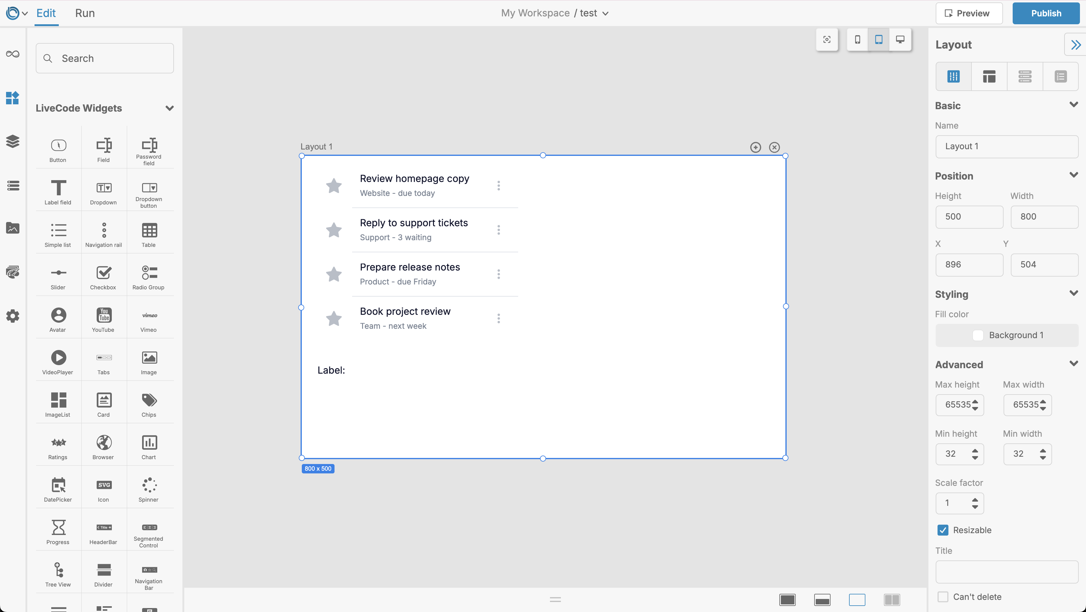
| Review homepage copy | Website - due today |
| Reply to support tickets | Support - 3 waiting |
| Prepare release notes | Product - due Friday |
| Book project review | Team - next week |
Subtitles are shown by default, so no extra display setting is needed.
Each row displays a title and subtitle. When we read the widget’s content property in a script, we can address a row by number; the returned row’s title key gives us its main text.
Styling
The list has separate colours for its ordinary, hover and highlighted states. Here is a compact blue-accented style you can run from the message box or put in your setup handler:
set the divider of widget "tasks" to "Inset"
set the dividerColor of widget "tasks" to 220,225,232

set the hoverColor of widget "tasks" to 245,248,252
set the hiliteColor of widget "tasks" to 232,240,254
set the titleHiliteColor of widget "tasks" to 26,115,232
set the subTitleHiliteColor of widget "tasks" to 50,90,145

set the titleTextSize of widget "tasks" to 16
set the subtitleTextSize of widget "tasks" to 13
divider can be "None", "Inset", or "Full". An inset divider starts in line with the text, while a full divider spans the widget’s width.
If the list needs to size itself to fit all its rows, formattedHeight reports the height its current content requires:
set the height of widget "tasks" to the formattedHeight of widget "tasks"
The widget also honours themeData, so an app-wide theme can supply its colours instead of setting each colour individually.
At this point your layout should look something like this:
Finding the row that was clicked
Open the script of the tasks widget and add this handler:
on mouseUp pButton, pEvent
   local tRow, tTasks

   put pEvent["row"] into tRow
   if tRow is empty then exit mouseUp
   if tRow < 1 then exit mouseUp

   put the content of me into tTasks
   set the hiliteIndex of me to tRow
   set the text of widget "taskDetails" to "Selected task: " & tTasks[tRow]["title"]
end mouseUp
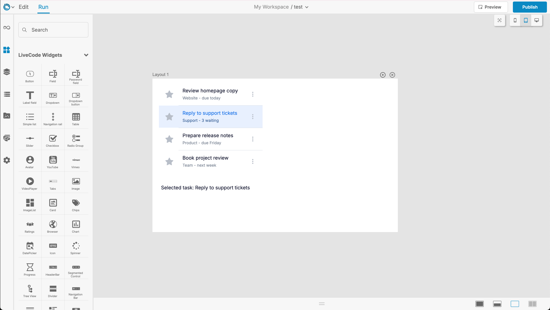
The Simple List uses an ordinary mouseUp handler, but it also supplies pEvent, an array describing where the click happened. pEvent["row"] is the number of the clicked row.
We use that number to read the task’s confirmed title value from content, and to set hiliteIndex so the selected row remains highlighted. The subtitle remains part of the row’s visual summary, while the detail widget displays the selected title.
Run the stack and click each task. The highlight and the detail display should move together.
Filtering the tasks
Add an Input Field widget above the list and name it taskSearch. Set its label to Search tasks.
The Simple List’s contentFilter property is scriptable but intentionally absent from the Property Inspector. Open the script of taskSearch and add:
on textChanged
   local tFilter

   put the text of me into tFilter["All"]["filterText"]
   put "Contains" into tFilter["All"]["filterType"]
   set the contentFilter of widget "tasks" to tFilter
end textChanged
textChanged runs whenever the Input Field’s contents change. The All filter searches both title and subtitle, so typing support finds Reply to support tickets, while Friday finds Prepare release notes. filterType is "Contains", which allows the search text to match part of a value.
Clear the search field and its empty filterText restores all four cached rows.
Properties reference
| Property | What it does |
|---|---|
content |
Stores the rows displayed by the list. |
showSubTitle |
Shows or hides each row’s subtitle. |
hiliteIndex |
Sets the row which should appear selected. |
contentFilter |
Filters rows; All searches their title and subtitle together. |
divider / dividerColor |
Controls the separators between rows. |
hoverColor / hiliteColor |
Controls the row background on hover and selection. |
titleColor / subTitleColor |
Controls the ordinary title and subtitle colours. |
titleTextSize / subtitleTextSize |
Controls the two text sizes. |
formattedHeight |
Reports the height required to display the current content. |
themeData |
Maps the widget’s appearance to the app theme. |
Once the task inbox is working, try replacing the sample rows with contacts, messages, project files, or any other data where a title and subtitle make a useful summary.