The Progress widget is LiveCode’s newest built-in progress indicator. It can be used to indicate exact progress values, or to show an idle loading animation. In this post we’ll build a download indicator that starts as a loading spinner and switches to a progress percentage tracking bar once the size is known.
Creating the widget
Drag a Progress widget from the Tools palette onto your stack, or create one from the message box:
create widget "prog" as "com.livecode.widget.progress"
set the rect of widget "prog" to 40,40,290,80
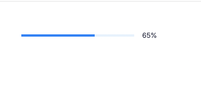
You can set its progress using the progressValue property on a 0–100 scale:
set the progressValue of widget "prog" to 65
Turn on the label to draw the value beside it:
set the showLabel of widget "prog" to true
A worked example: a download indicator
Here’s a script that shows off how the progress widget could be utilized for tracking a file download. It simulates the time spent evaluating how large the download will be to show the widget as a circular idle loading spinner, then when the size is determined, it turns into a standard progress bar, displaying the download progress until it’s finished.
local sReceived, sTotal

on mouseUp
   set the style of widget "prog" to "circular"
   set the showLabel of widget "prog" to false
   set the progressValue of widget "prog" to empty
   put 0 into sReceived
   send "discoverSize" to me in 1.5 seconds
end mouseUp

on discoverSize
   put 4096 into sTotal
   set the style of widget "prog" to "linear"
   set the showLabel of widget "prog" to true
   set the progressValue of widget "prog" to 0
   send "receiveChunk" to me in 60 milliseconds
end discoverSize

on receiveChunk
   add 128 to sReceived
   if sReceived >= sTotal then
      set the progressValue of widget "prog" to 100
      exit receiveChunk
   end if
   set the progressValue of widget "prog" to sReceived / sTotal * 100
   send "receiveChunk" to me in 60 milliseconds
end receiveChunk
Note that to achieve the widget’s idle animation, you simply set its progressValue to empty. If you don’t want the animation, but want an empty bar, you set it to 0 instead.
Styling
style chooses between a horizontal bar ("linear", the default) and a ring ("circular"); give a circular widget a roughly square rect so the ring isn’t clipped. barSize sets the thickness of the bar or ring, and roundHeight rounds the ends of the linear bar (it has no effect on the circular style):
set the style of widget "prog" to "linear"
set the barSize of widget "prog" to 8
set the roundHeight of widget "prog" to 4
set the barColor of widget "prog" to 40,40,185
set the labelColor of widget "prog" to 40,40,185
The track behind the bar is a faint version of barColor, so setting one colour styles both the fill and its background.
The widget honours theming, so it can easily be made to be the same colors and style as the rest of your project.
Properties reference
| Property | Type | Default | What it does |
|---|---|---|---|
progressValue |
number 0–100, or empty | empty | Current value. A number is determinate; empty is indeterminate. |
style |
linear / circular |
linear |
Horizontal bar or ring. |
showLabel |
boolean | false |
Draw the % label (determinate only). |
barSize |
number | 4 |
Thickness of the bar or ring. |
roundHeight |
number | 0 |
Corner radius of the linear bar (linear only). |
barColor |
RGB | 50,50,250 |
Fill colour; the track is a faint version of it. |
labelColor |
RGB | 75,75,75 |
Colour of the % label. |
useAnimations |
boolean | true |
Animate value changes and run the indeterminate motion. |
textFont / textSize / textStyle |
text | size 16 |
Font of the label. |
themeData |
array | role bindings | Binds barColor and labelColor to your theme palette. |