Build an app sidebar with the Navigation Drawer widget
The Navigation Drawer widget is built for being a vertical navigation panel with icons and expandable sections with nested items and a selection that stays in sync as the user moves
around your app. In this guide we’ll build a real, collapsible sidebar for a small “workspace” app: a Dashboard, a couple of grouped sections that expand to reveal their pages, and a Settings item.
Creating the design
Drag a Navigation Drawer from the Tools palette onto your stack and name it something like nav, or create it from the message box:
create widget "nav" as "com.livecode.widget.navigationdrawer"
set the rect of widget "nav" to 0,0,220,480
Everything the drawer displays comes from a single content property, so let’s build that next. The content property is an array of item records. Each item is small and readable:
| Key | What it does |
|---|---|
type |
"button" for a navigable item, or "divider" for a separator |
name |
a unique id you’ll match on in code |
label |
the text shown in the row |
icon |
an icon, e.g. “home” |
expandable |
true turns the item into a collapsible section header |
expanded |
whether that section starts open |
indent |
nesting depth — 0 for top level, 1 for a child, and so on |
Here’s the full menu: a Dashboard, an expandable Projects section with two children, a divider, and Settings. Put this in a handler on your stack (say, a buildMenu command you call from preOpenStack):
command buildMenu
   local tMenu

   -- Dashboard
   put "button"    into tMenu[1]["type"]
   put "dashboard" into tMenu[1]["name"]
   put "Dashboard" into tMenu[1]["label"]
   put "house" into tMenu[1]["icon"]
   put 0 into tMenu[1]["indent"]

   -- Projects
   put "button"   into tMenu[2]["type"]
   put "projects" into tMenu[2]["name"]
   put "Projects" into tMenu[2]["label"]
   put "list" into tMenu[2]["icon"]
   put true into tMenu[2]["expandable"]
   put true into tMenu[2]["expanded"]
   put 0 into tMenu[2]["indent"]

   put "button" into tMenu[3]["type"]
   put "active" into tMenu[3]["name"]
   put "Active" into tMenu[3]["label"]
   put "file" into tMenu[3]["icon"]
   put 1 into tMenu[3]["indent"]

   put "button"   into tMenu[4]["type"]
   put "archived" into tMenu[4]["name"]
   put "Archived" into tMenu[4]["label"]
   put "file" into tMenu[4]["icon"]
   put 1 into tMenu[4]["indent"]

   -- A divider
   put "divider" into tMenu[5]["type"]

   -- Settings
   put "button"   into tMenu[6]["type"]
   put "settings" into tMenu[6]["name"]
   put "Settings" into tMenu[6]["label"]
   put "gear" into tMenu[6]["icon"]
   put 0 into tMenu[6]["indent"]

   set the content of widget "nav" to tMenu
end buildMen
Run it and you’ve got a working menu, where clicking Projects makes its two children fold away and back.
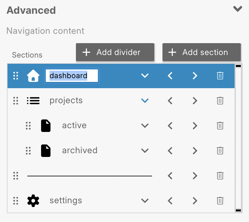
This can all also be managed visually using the Navigation content table in the Advanced section of the widget’s Property Inspector: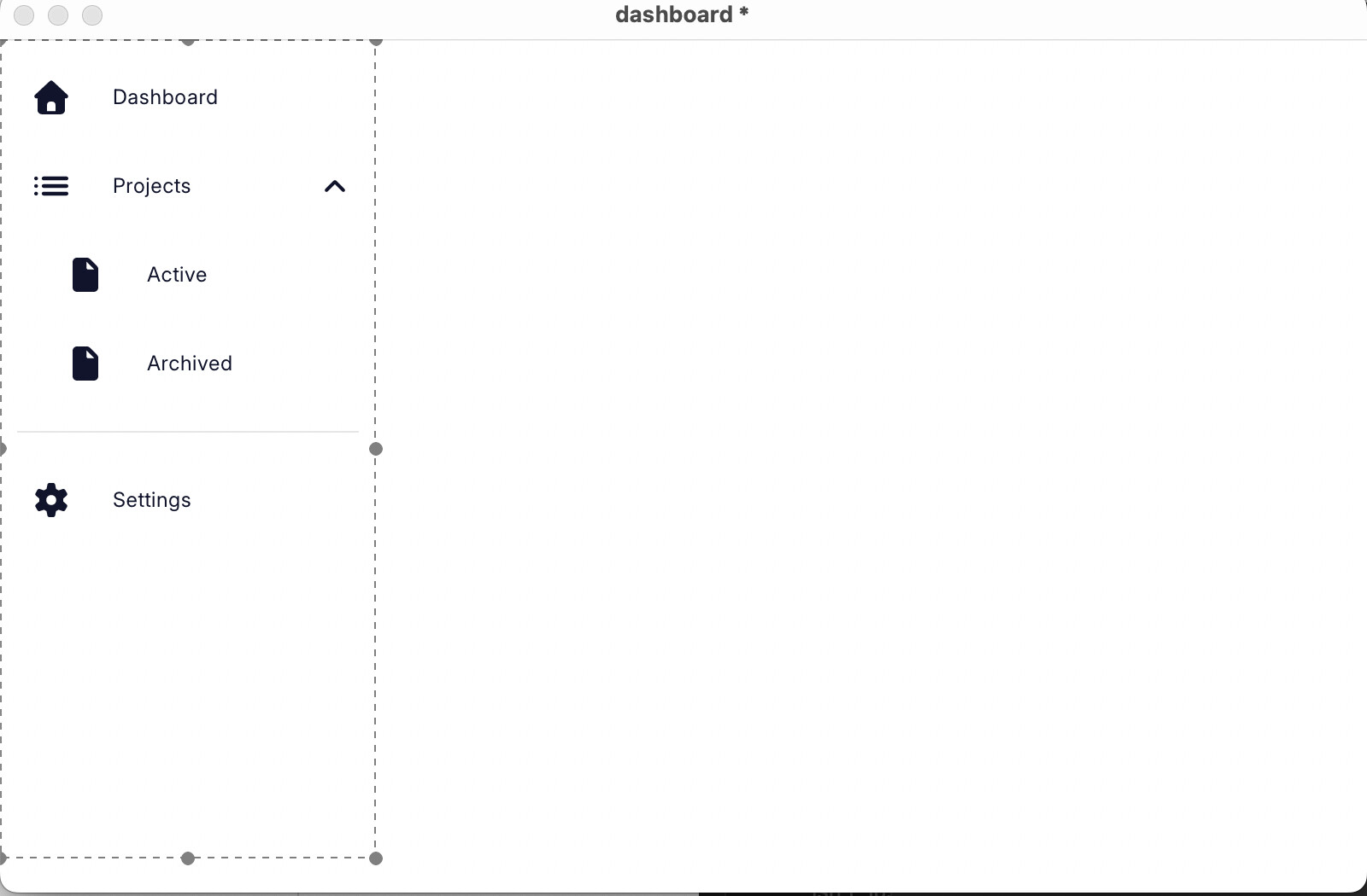
Adding functionality
When the user picks an item, the drawer sends navigationDrawerSelectionChanged, passing the selected item’s record as a parameter. For each of the four navigable items in our navigation drawer, create a new stack and name it appropriately. Make sure each stack has a copy of the navigation drawer, then put this in the script of each stack:
on navigationDrawerSelectionChanged pItem
   switch pItem["name"]
      case "dashboard"
         go stack "Dashboard"
         break
      case "active"
         go stack "ActiveProjects"
         break
      case "archived"
         go stack "ArchivedProjects"
         break
      case "settings"
         go stack "Settings"
         break
   end switch
end navigationDrawerSelectionChanged
Notice we don’t handle projects — an expandable section header opens and closes its children rather than navigating, so there’s nothing to route.
Keep the highlight in sync
A good sidebar always shows where you are. Use the script below on each of your stacks so the drawer always highlights the item that matches the current screen:
-- on the Dashboard stack
on preOpenStack
   set the hilitedItemName of widget "nav" to "dashboard"
end preOpenStack
Styling
The drawer is styled through straightforward properties, each with a sensible default, so you only set what you want to change:
- Rows:
itemHeight,itemPadding,itemRoundRadius,iconSize,indentSize,showIcons,labelAlign(left/center/right),expandIconSize. - Selected & hover:
hilitedItemColor,hilitedTextColor,hilitedIconColor,hoverColor, andiconColorfor the default icon tint. - Dividers:
dividerColor,dividerThickness,dividerMargin.
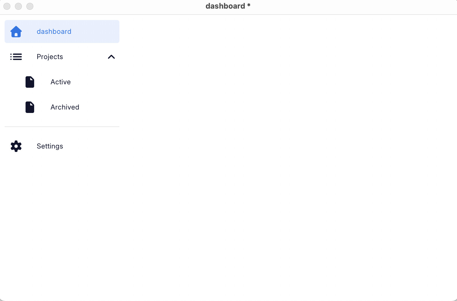
A compact, blue-accented look:
set the itemHeight of widget "nav" to 40
set the indentSize of widget "nav" to 24
set the hilitedItemColor of widget "nav" to "232,240,254"
set the hilitedTextColor of widget "nav" to "26,115,232"
set the hilitedIconColor of widget "nav" to "26,115,232"
set the hoverColor of widget "nav" to "245,245,245"
If you’re theming a whole app at once, the drawer also honours themeData / textTheme, so it can pick up your colours automatically instead of setting each one by hand.