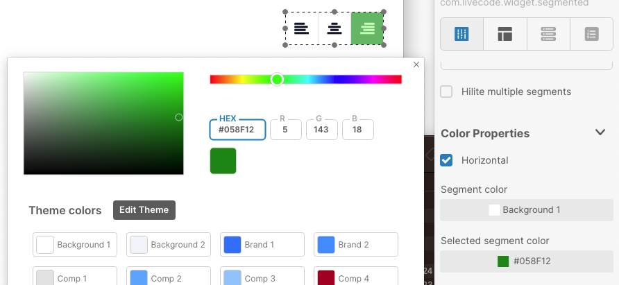
As shown in the screenshot, the color selected for the chosen control is not the one used in the “rest” state when the mouse is not hovering over the control.
It would be a good idea to add a color setting for the “hover” state and keep the current setting for the color of the selected item.
Thanks for the report @ludo ! I have filed this and we are working towards a resolution. Check back here for an update on when this is fixed. We appreciate you taking the time to help us improve LiveCode Create.
This is still true in create classic 11, sixteen months after the initial report. You can set the hilitecolor of the segmented control but that’s only the color of the hilited segment when it has focus. When it loses focus, the color changes (looks like the blend level drops). And there is a mouse hover color which looks like an addition decrease in blend level. But none of this is exposed.
It would be very helpful if these colors were either exposed so they could be set, or if you could choose whether the segmented control uses the old or new color behavior.
I was looking at whether I could move a project from classic 10 to create classic 11, but having a couple prominently displayed segmented controls change from the blue hilite I set (which is one of the main theme colors in the app) to a violet hilite (which is not a color used anywhere else in the app) when they lose focus sent me back to classic 10.